service design
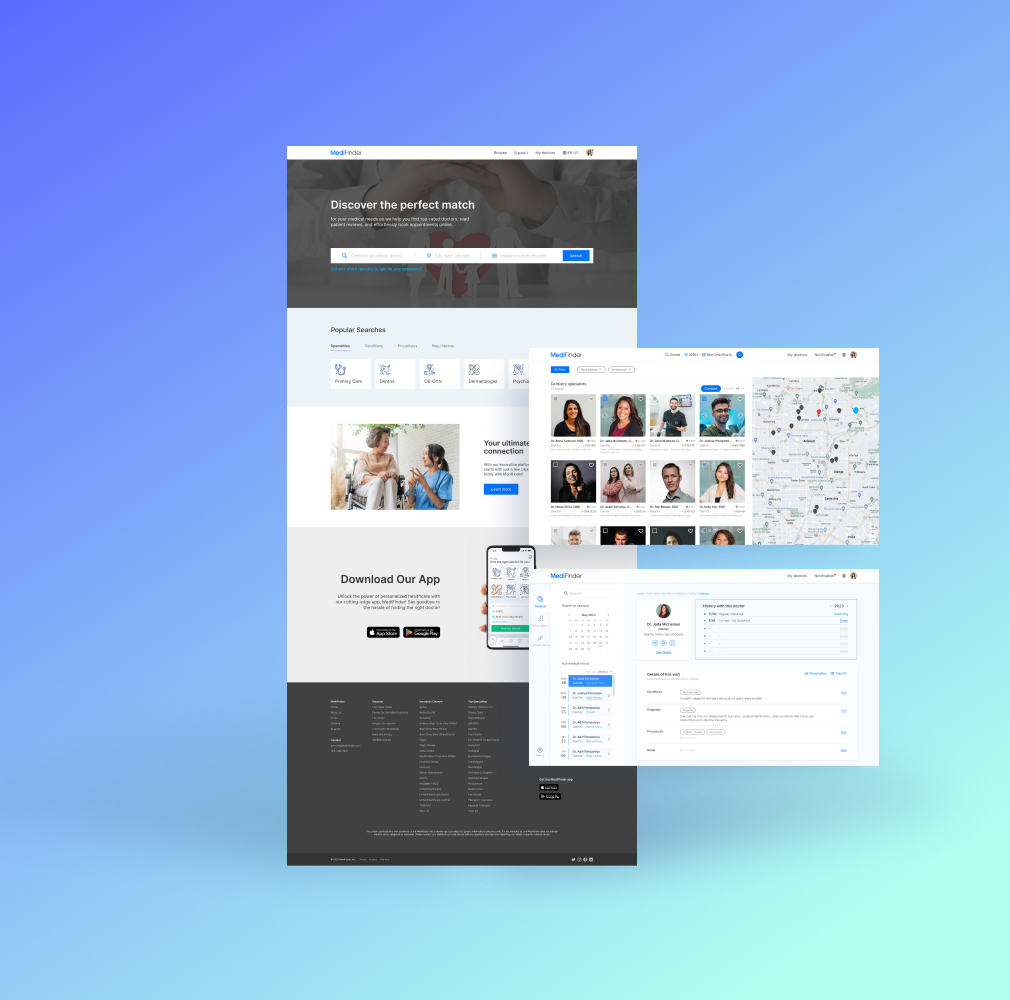
MediFinder
MediFinder solves the problem of finding and booking doctor appointments by offering a user-friendly platform that connects patients with healthcare providers quickly and efficiently.
Project overview
It’s frustrating looking for a doctor when you’re unwell. Especially in the US, it’s tough to find the right doctor, one who fits your symptoms and takes your insurance. MediFinder is a project exploring solutions to ease these difficulties.
project type
Team Project
duration
6 Weeks
role
User Research 50%
User Interview 60%
UX/UI Design 70%
Prototyping 100%
Usability Testing 40%
User Interview 60%
UX/UI Design 70%
Prototyping 100%
Usability Testing 40%
Tools
Figma, Figjam
Problem
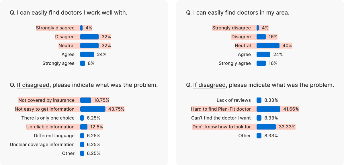
57% of respondents stated “It was difficult to find a doctor who was work well with”
Respondents aged 26 to 34 shared that locating a doctor is challenging due to issues like information reliability, review scarcity and not knowing about their own insurance, despite using diverse methods for search.
How might we simplify the process of finding suitable doctor for all conditions?
main features
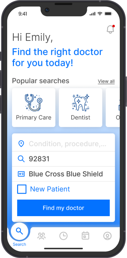
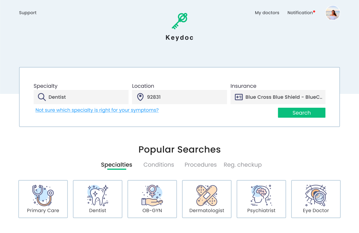
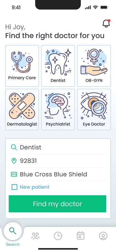
Easy search
Few Efforts, Find Doctor
To see doctors based on your desired conditions, simply input the details with a few efforts. Entering your insurance and location once will auto-complete them for convenience.
comparison
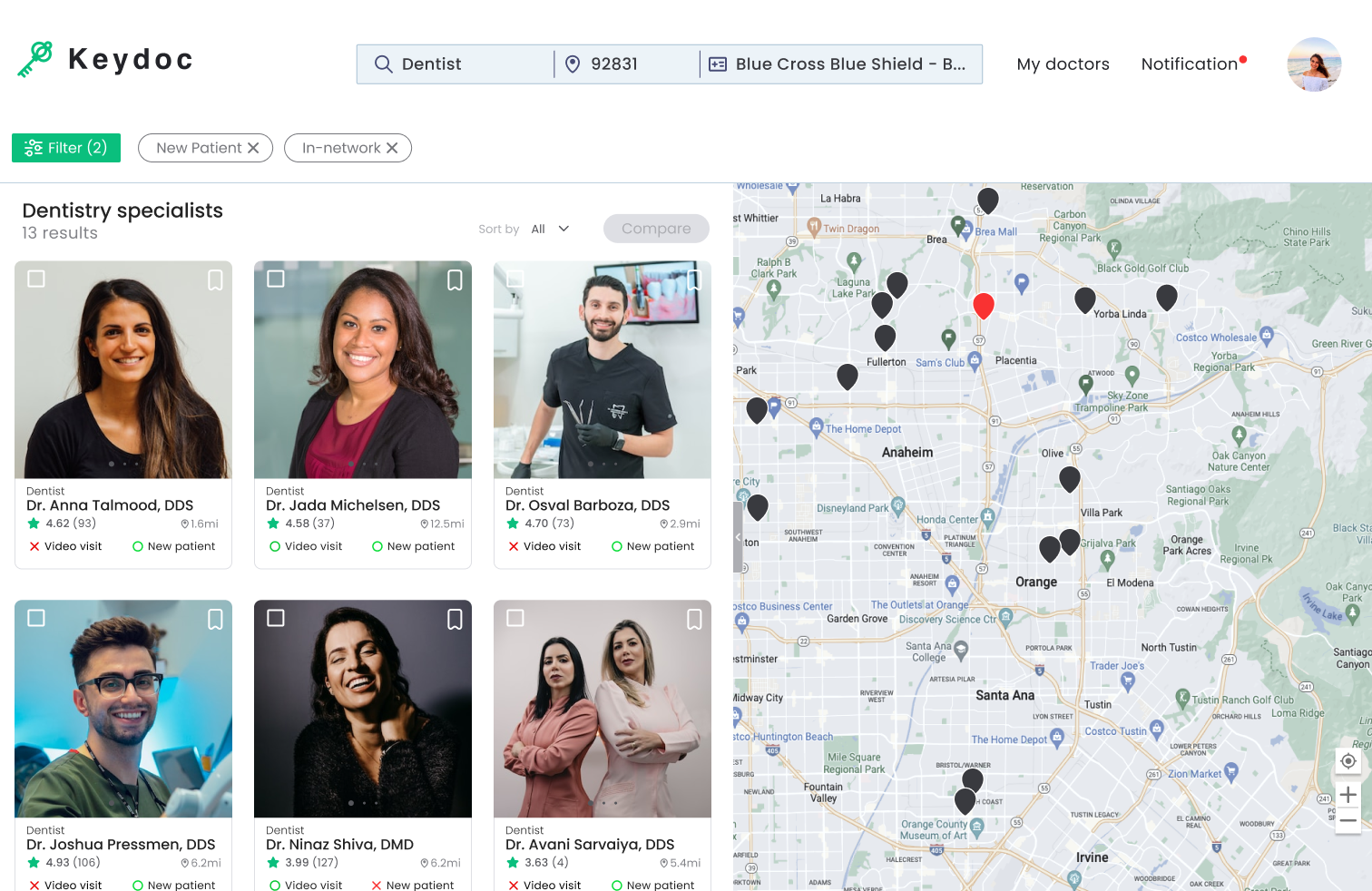
Control Visibility for Doctor comparisons
Utilize the ‘Compare’ button for swift side-by-side doctor assessments on one screen. In addition, save the doctors for effortless future reference.
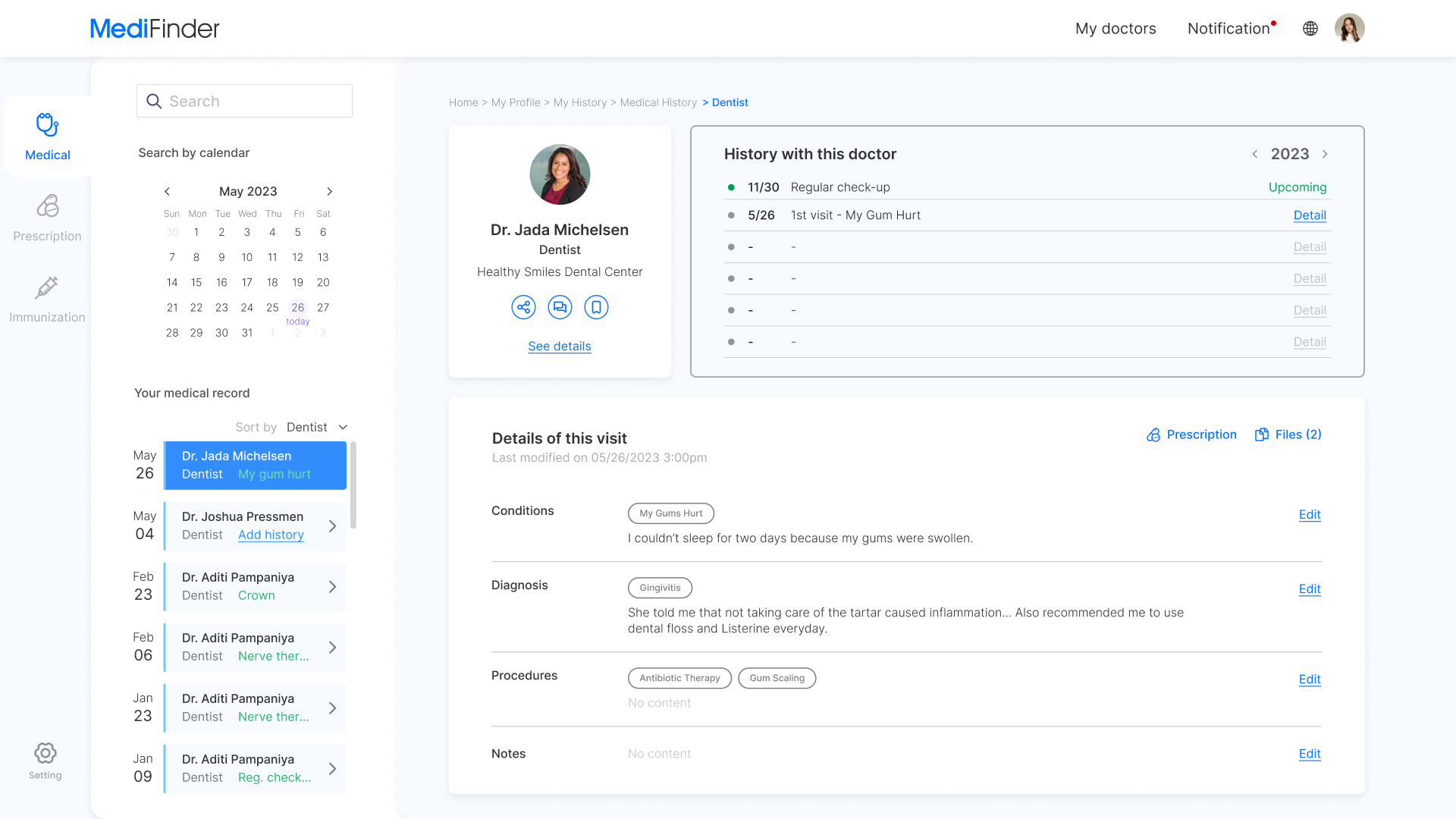
medical record
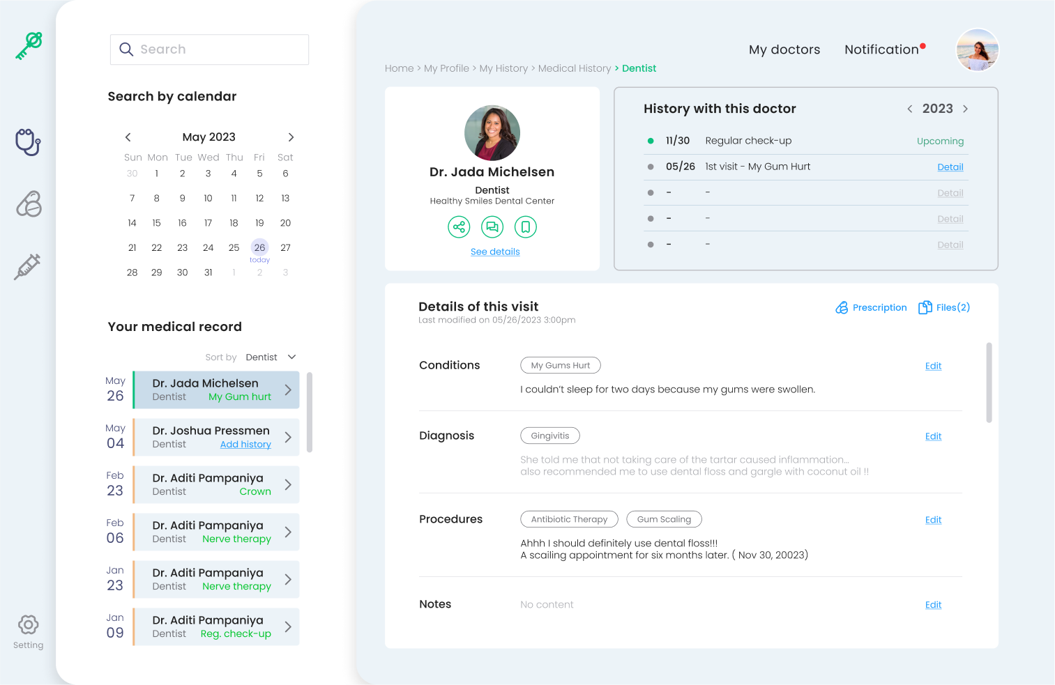
Easily Handle Health Records
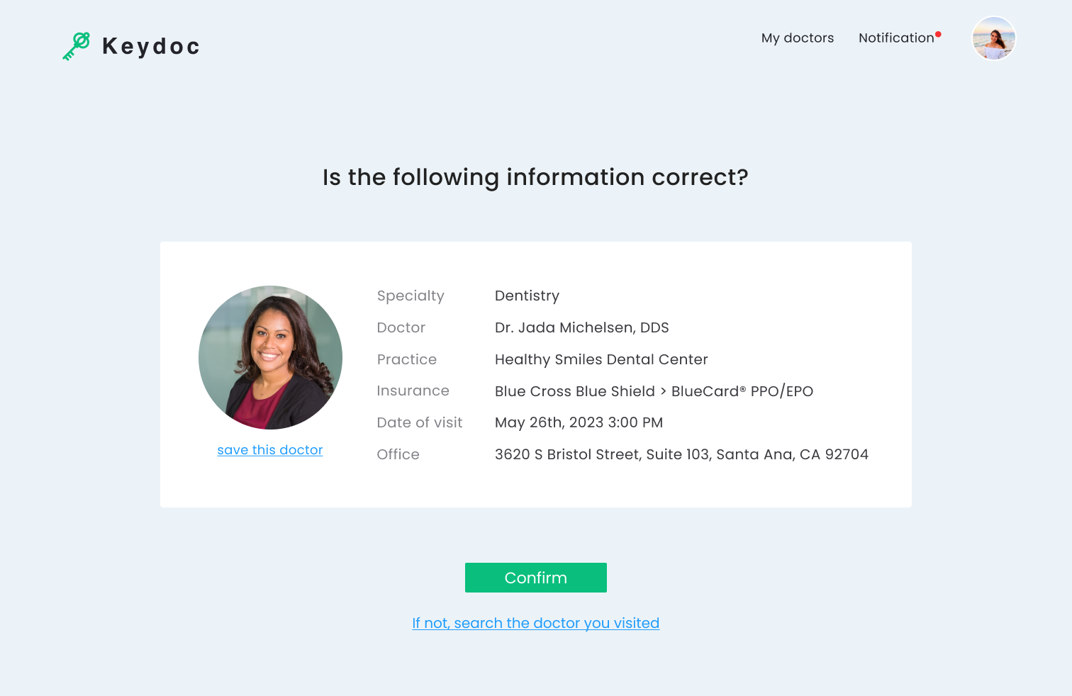
Right after a doctor’s visit, effortlessly log your health. And review all medical records in the ‘ My history’ section.
mobility
Discover Doctors, Manage Records Anywhere
Through the app linked with the account, you can check appointments or health records anytime, anywhere.
project process - roadmap
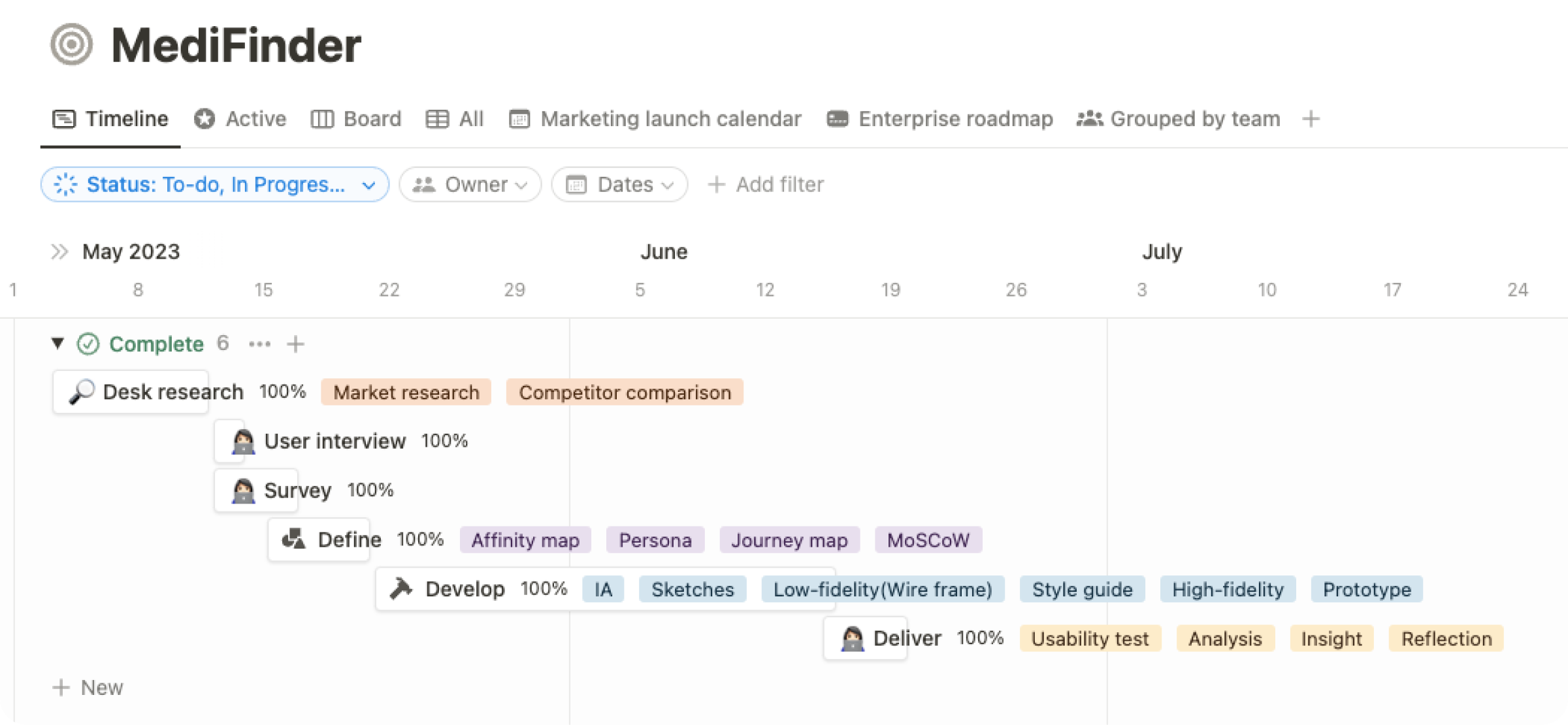
1. discover/
desk research
Numerous methods to find doctors
There are many ways, such as search on Google, insurance company websites, and platforms to find a doctor.
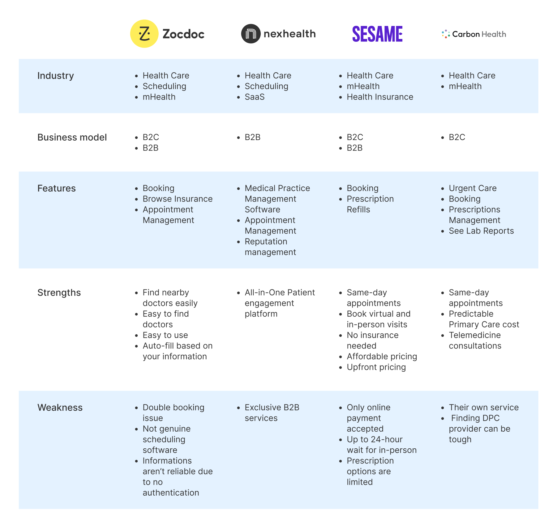
Why is finding a doctor challenging despite the various methods available?
1. discover/
User interview
Interviewees
5
Ages
28-56
Insurance
Yes
All interviews were conducted virtually with U.S. residents. The participants comprised 80% aged between 26 and 34, and 20% aged 45 or older, all of whom possessed insurance.
Highlights
“I didn’t know what to do or where to start!”
Keyword 1
Reliable Information
Keyword 2
Efficient Search Process
Keyword 3
Effortless Comparison
Research questionnaire
- How often do you search for a new doctor?
- How could you find a doctor who accepts your insurance?
- When looking for a doctor, what other informations are important other than insurance?
- Have you ever felt uncomfortable when finding a doctor for the first time?
- Were there any difficulties when revisiting?

1. discover/
survey
Respondents
25
Ages
18-54
Insurance
Yes
The survey was conducted online among U.S. residents. Participants included 8% aged 18-25, 56% aged 26-34, 24% aged 35-44, and 12% aged 45-54, all of whom possessed insurance.
2. define/
affinity map
Affinity mapping was conducted using cards derived from extracting repeated and impactful opinions obtained through interviews and surveys.
clustering
Obtain Information
Clear information
Want to see all the informations about doctor’s office
New patient acceptance
Want to kow acceptance of new patients prior
Price
Want to know which doctor is more affordable
Sorting by
Difficulty finding a doctor by gender
Insurance related
Want to know what extent my insurance covers
Reviews
Is it up-to-date or reliable reviews?
Favorite
Want to save doctor information for later
Post-visit Issue
Make an appointment
Want easily schedule next visit
Medical record
It is difficult to remember medical records in detail
Prescription history
Track prescription history feature would be nice
Compare doctors
Automation of comparing doctors
Additional Feature
Registration form
Want the feature that help to fill out patient registration form
Translation service
It would be nice to have a translation service
Explanation of benefit
Desire to access Explanation of benefits
Customer Service
Long wait time
The biggest pain point is the lengthy process
Real-time CS
Immediate, human customer service, Not automated resposes
2. define/
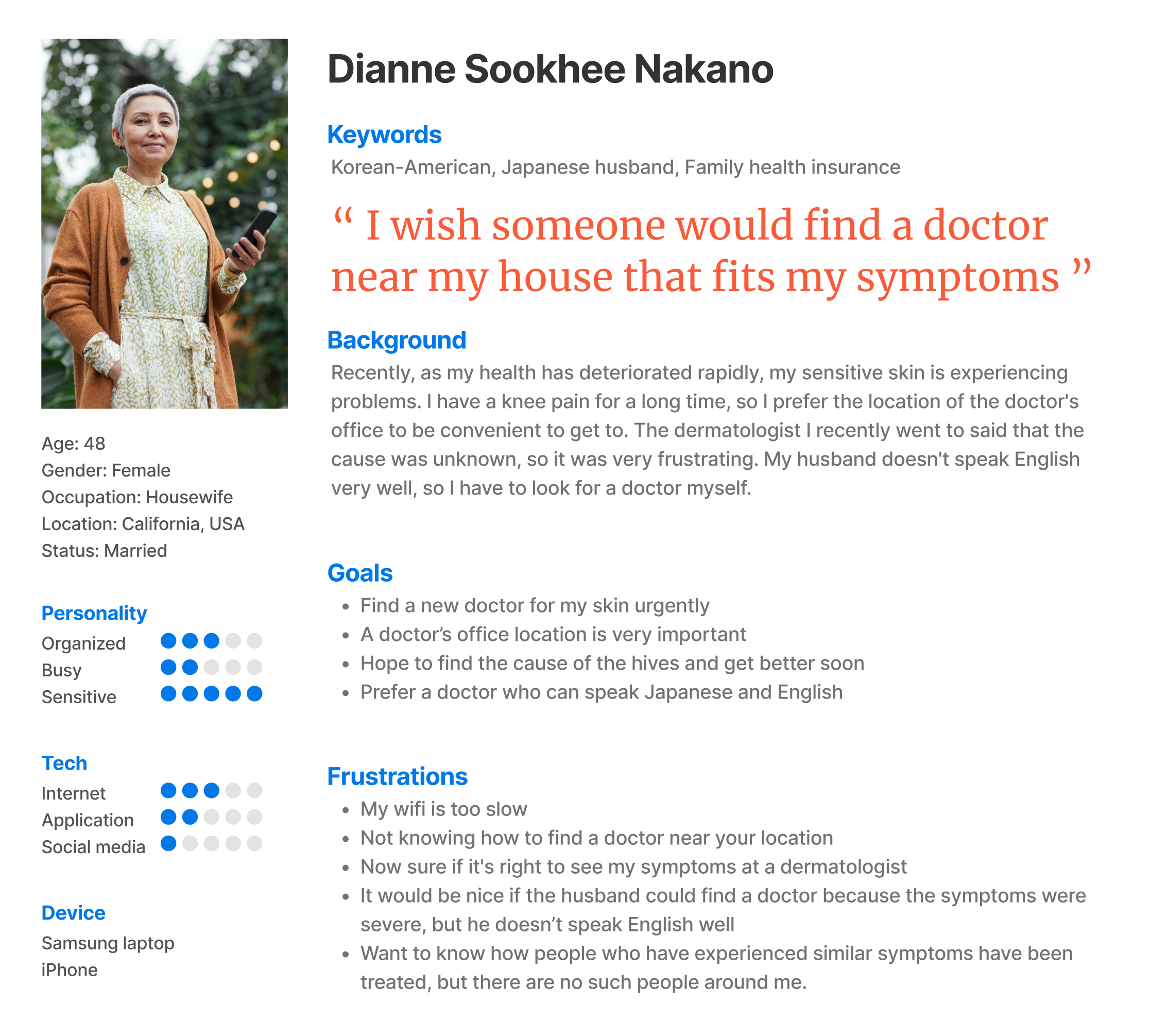
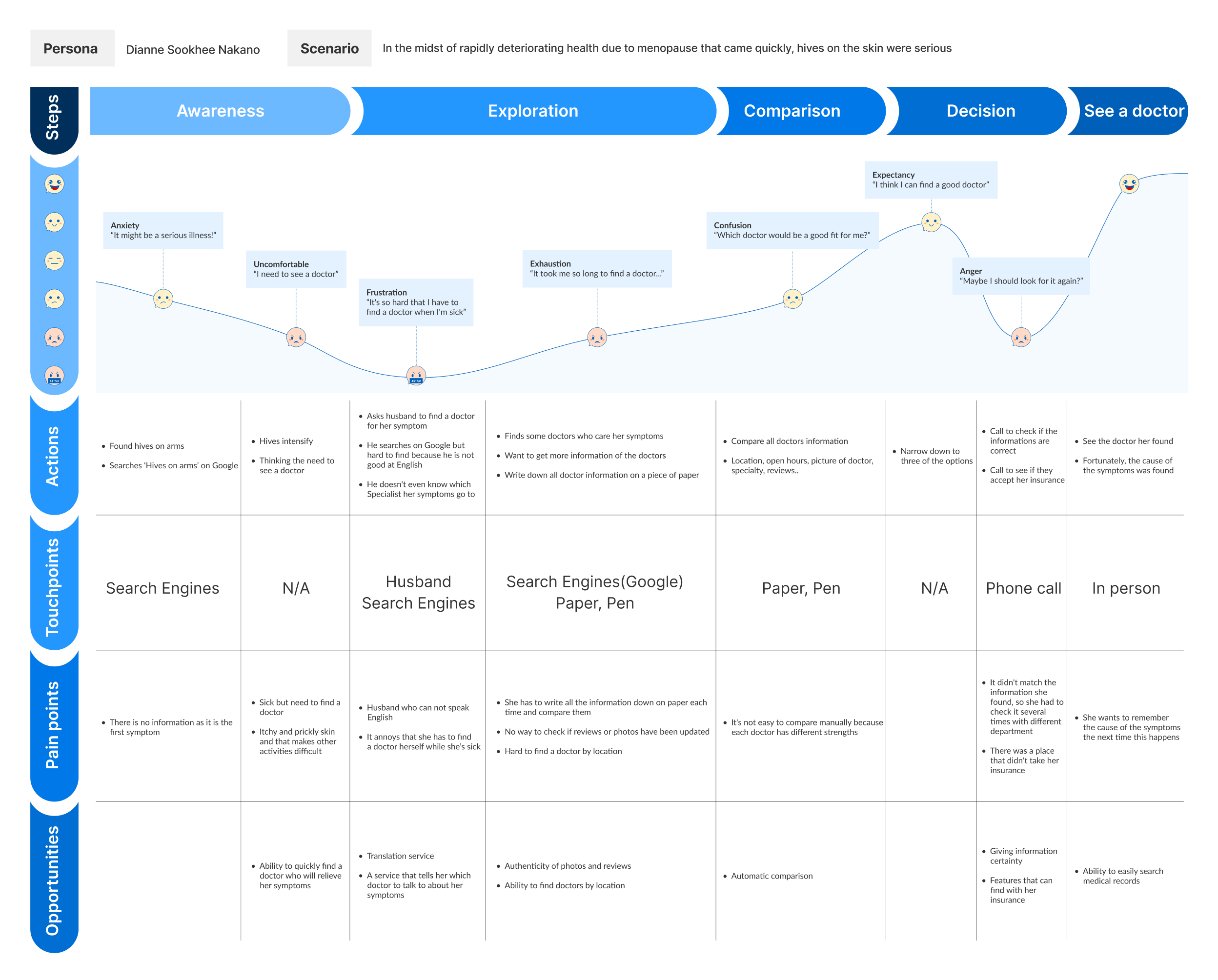
Persona & journey map
We crafted representative users embodying the needs of a broader user base. This helped me understand my audience better.
2. define/
moscow prioritization
M
MUST HAVE
Scheduling
Medical history
Favorite
Compare doctors
Sorting system
Effortless review
Sorting system
S
SHOULD HAVE
Auto-fill
registration form
registration form
Accurate
insurance details
insurance details
Prescription history
New patient
acceptance
acceptance
C
COULD HAVE
Clear information
Reliable reviews
Explanation of benefit
Translation service
W
WILL NOT HAVE
Real time CS
Long wait time
Price
3. develop/
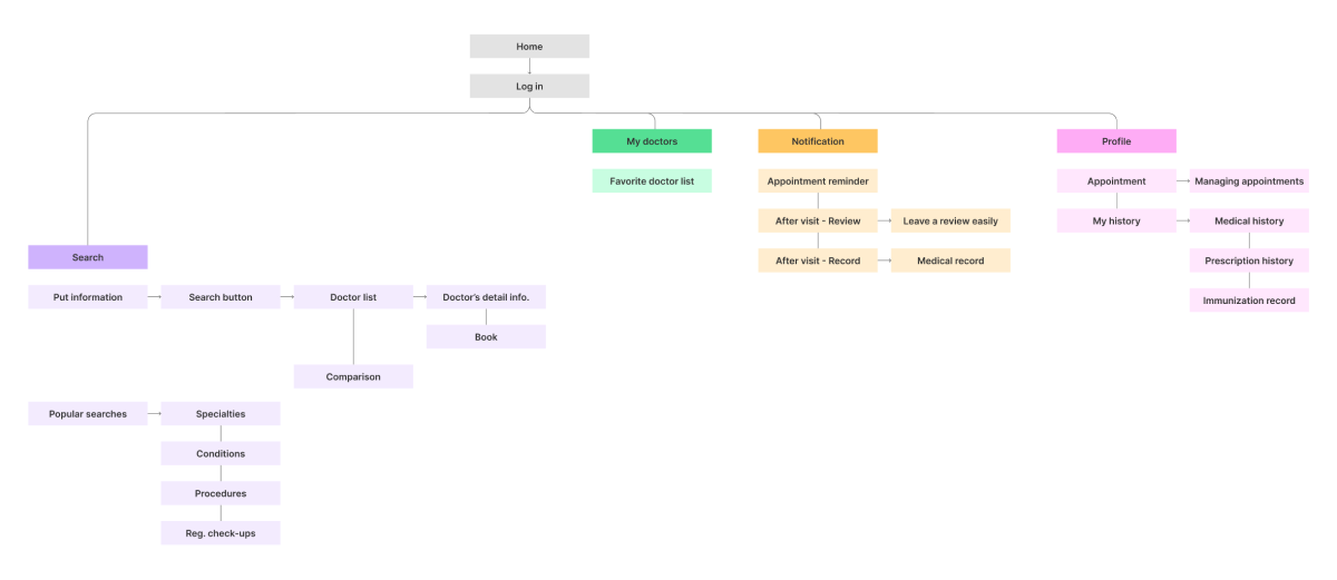
ia & sketch
Before diving into sketching, we prioritize information architecture in a way that meets user needs and follows user flows.
3. develop/
style guide
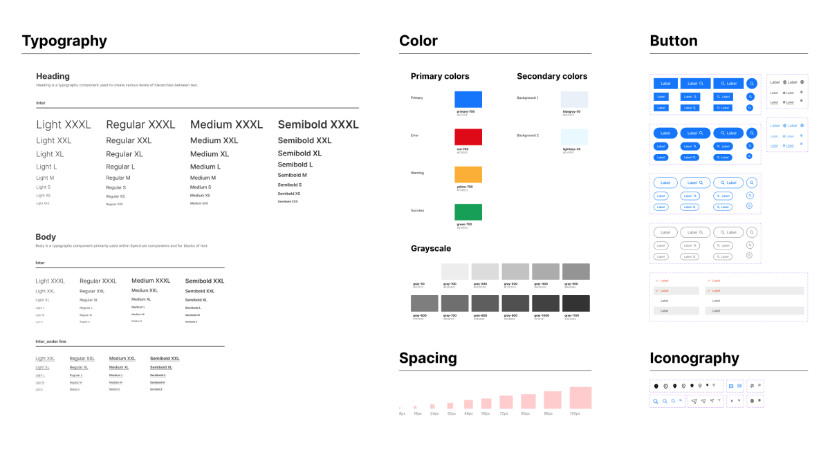
As a platform for finding doctors, we’ve crafted a style guide prioritizing reliability and readability.
3. develop/
low-fidelity_wire frame
01
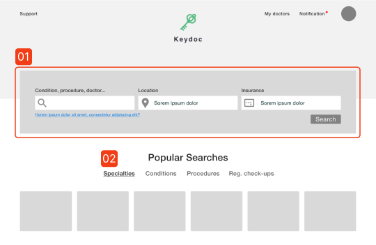
Each field aids in searching by symptom, location, and insurance information
02
Shortcut
03
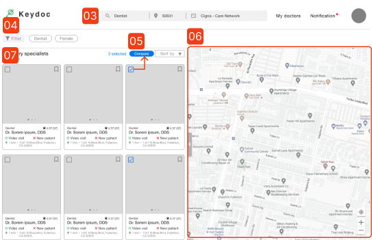
Search bar
04
Filter
05
When the checkbox is clicked, ‘Comparison function’ is activated
06
Search by map
07
Search result list of doctors; Simple comparable information such as star rating are displayed
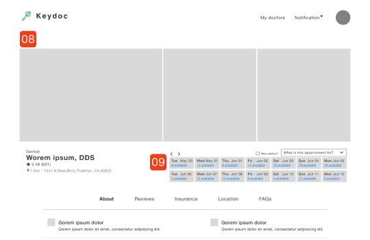
08
Pictures by doctor; Including the doctor’s face, office setting, and staff pictures
09
Booking: Displays open slots and select purpose of visit
10
Filter, search by calendar, search icon
11
Detail information of the visit
12
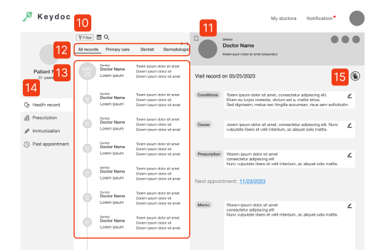
Tabs for viewing by specialty
13
Display doctor visits chronologically
14
Tabs display Health record, Prescription history, Immunization record and Past appointment
15
Save documents related to this visit
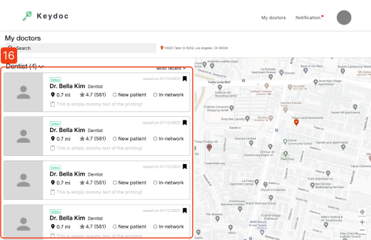
16
Saved doctor list; Horizontal display of information
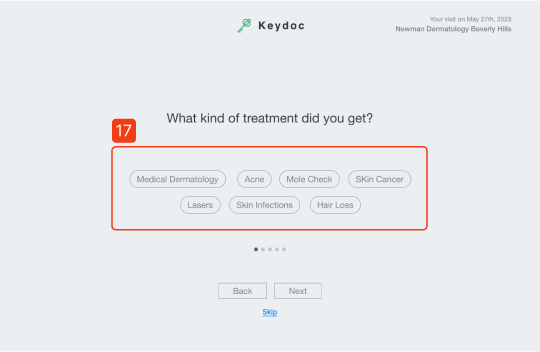
17
Concise response selection
4. deliver/
iteration
We iteratively improved our designs using insightful input from senior mentors and virtual usability testing. Notably, we tested usability with 5 users, each completing 3 tasks.
task
Find a doctor that fits your criteria
Save and compare doctor information
Record after visiting
user 1 (♀/32)
“Usually, there’s more information that the picture, but the pictures are so helpful.”
user 2 (♂/32)
“Tracking prescription history is a valuable feature.”
user 3 (♂/30)
“I think being able to manage health records in one place is a very convenient feature.”
user 4 (♀/26)
She mentioned that leaving a review was a lengthy and tiresome process.
user 5 (♀/34)
“I’d like to see phone number or email to contact.”
major inprovement
search page
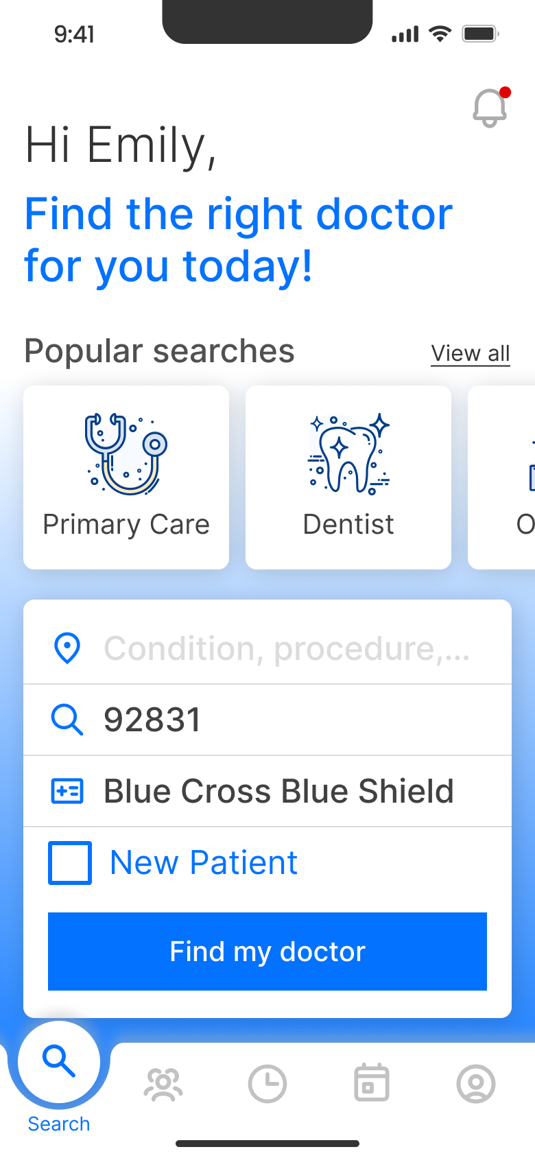
Highlight ‘Easy Search’ with background contrast
Color contrast guides user to the search field which is the main feature, minimizing eye movement with a single-line arrangement.
Comparison
Emphasize ‘Comparison’ button with color
To indicate the comparison function, add a blue color to the button.
medical record
Made UI adjustments
We’ve enhanced readability by reducing unnecessary colors and increasing the detailed contents screen area.
Post-visit logging
Centralizing information for better focus
Reconfigured to centralize information for quick scanning and easy input. In addition, button height was increased for improved accessibility.
history1.png)
Mobility
Thumb-Friendly, high accessibility zone
To enhance accessibility, we positioned the search field in the thumb zone. However, to improve visibility, we reduced the color of the ‘Popular searches’ icon and increased the contrast between background and search field.
What I’ve learned
- Shifting from what I knew to data from research, surveys, and interviews was tough. Analyzing it, I discovered new, interesting facts — breaking old thinking patterns.
- By usability testing, I learned about users’ specific requirements and habitual operating methods.
- Team project was useful, though I noticed challenges with time and pace adjustments. We balanced tasks through talks, shared tips, found errors together, and learned from strengths. Meetings and joint research helped when stuck. This taught me teamwork and coordination.
Next Step
I plan to build upon the product design opportunity to extend the MVP model. With additional time, I’m enthusiastic about using my expertise to enhance the basic product into a comprehensive and resilient solution.
This includes refining existing features, functionality, and enhancing the overall user experience through iterations.
This includes refining existing features, functionality, and enhancing the overall user experience through iterations.